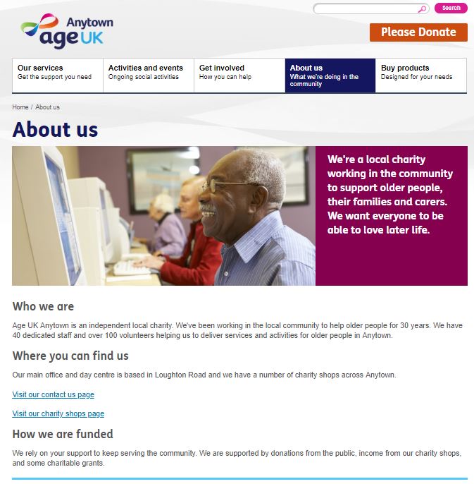
 Your ‘About Us’ page is one of the most important on your website. People come to it because they’re interested in learning more about who you are and what you do. Here’s how to make the most of it.
Think about what you want when you visit an ‘About Us’ page. Most likely you’re looking to get a quick idea of what the organisation or business is about, what they aim for and how they work. The ‘About Us’ page is your chance to sell your organisation and the work that you do. It isn’t the place to display your mission statement in full, talk in depth about your history or to place your contact details, although you could include links to this information on this page.
What to include
- Intro text. This appears just under the page title and is a great place to put a short sentence encapsulating what it is your organisation does.
- Headings and bullet points. Break up the content by including headings and bullet points. This makes the page easier to read and helps visitors who may be looking for a specific piece of information.
- Who we are. Briefly outline who you are and what your aim is. It’s best to keep this section short and provide links to more in-depth detail elsewhere.
- What we do. Give some concrete examples of your work and don’t forget to include the impact it has had. For example, if you provide Sunday Lunch for local older people you could mention how many people attended in the previous year.
- How you can help. If a visitor is reading your ‘About us’ page, they’re probably interested in your organisation. Make the most of this by including a link to your donation, volunteering or fundraising pages.
- Meet our staff. Consider having a ‘meet our staff’ section. This adds a human dimension to the organisation, builds trust and adds transparency. If you don’t already have pages with staff bios you could just include a photo and short bio of your CEO.
- Endorsements or donor logos. Mention any official endorsements or donors on your ‘About Us’ page. Logos in particular build trust, but make sure you’re using the official logos. Fuzzy or off-colour logos will look suspicious.
- Related pages. The ‘About us’ page isn’t the place to go into detail about your mission statement, annual report or history. Including links to these pages and documents means that anyone who’s interested can easily find them. Making your annual reports freely available is important to build trust.
About Age UK Anytown
Our example page shows what the ‘About Us’ page could look like:

