 Many people face challenges when using websites due to physical or intellectual disabilities. Improving the web accessibility of your site means that more people will be able to use it effectively. In this guide you will find:
- Key accessibility issues your users may face
- Guidelines for creating accessible content
- Accessibility checklist
- Further resources
1. Key accessibility issues your users may face
Here is an overview of what accessibility issues someone using your website might face.
Blind or partially sighted users may use screen reading software which will read out what is on the webpage. Users with visual impairments may choose to magnify the screen or enlarge the text size to enable them to see it more clearly.
Deaf or hard of hearing users may need subtitles on videos. Written English may be their second language after sign language.
Mobility impaired users may use the keyboard for navigation rather than a mouse.
Users with learning difficulties or cognitive impairments such as autism, dyslexia, or dementia may find some information difficult to understand or absorb.
2. Guidelines for creating accessible web content
a) Write clearly
Clear content is always important, but even more so for users with learning difficulties, cognitive impairments, or those using screen readers. Follow our guidelines to writing for the web and your copy will be clear and easy to read.
b) Headings
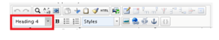
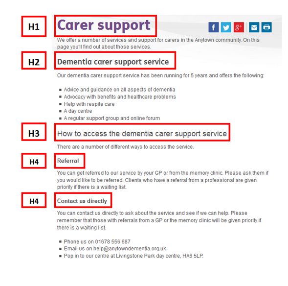
Headings and paragraphs are a good way to break up a block of text and signpost important content. Many screen readers allow users to navigate between headings on a page of content so it’s important to use headings correctly. Episerver allows you to select different headings from a drop-down menu – see the ringed image below.
HEADING 1 – what the page is about (This is the page title). This is essential. There should only be one HEADING 1 heading on a page.
HEADING 2 – sub-topics of the main heading, on a page that contains a range of topics
(there may be several of these.)
HEADING 3 – used when there are different sub-topics within an H2 topic.
HEADING 4 – if HEADING 3 covers more than one topic.
HEADING 5 – if HEADING 4 covers more than one topic.
HEADING 6 – if HEADING 5 covers more than one topic.
Here’s an example of how you might use headings on a page:
c) Paragraphs
Make sure that paragraphs are left-aligned, as some readers – for example those with dyslexia – struggle with the uneven spacing used in justfied paragraphs.
d) Links and downloads
Screen-reader users often navigate from link to link, missing out the text in-between, so it’s important that your links make sense out of context. If you were creating a link to your services page, for example, instead of a link that just says “click here for more information” you could use “find out more about our services”.
Make it clear if you are linking to a downloadable file. This means that web users can decide whether to download it or not. The easiest way to do this is to include the type of file and size in the link. For example, instead of this:
![]()
your link would read:

Sizes are usually expressed in KB (kilobtye) or MB (megabyte).
To find out the size of a PDF go to “File” then “Properties”, the size of the PDF is towards the bottom of the box, with the heading “File Size”.
To find out the size of a Word Document go to “File” then “Info”, the size of the document is on the right hand side, under the heading “Properties”.
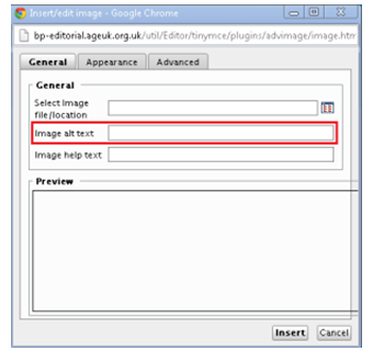
e) Text alternatives to images
Screen-readers and text-only browsers are unable to display images. To address this, enter a short-description of the image in the “Image alt text” box when uploading images. This description will be read out or displayed instead of the image. If there is no image alt text, a screen reader may just read out the uploaded image file name instead, which could be very confusing for a user.
You add these alt texts in the image editor.
f) Colour contrast
Some users may struggle to read text where there is insufficient contrast with the background colour. The Age UK brand colours are checked and approved for accessibility purposes. Users also have the option to change the colour contrast on our webpages by clicking on the button in the top right hand corner:
![]()
g) Font size
Font size may appear differently depending on what device the user is using to access your website, and what screen settings they have. Some users may use a magnifying app. All visitors to your website have the option to adjust the font size by using the button in the top right hand corner of your website:
![]()
h) Videos
Videos should be understandable for those who are deaf or hard of hearing (this also helps users without speakers or who are in a noisy environment). Make sure videos are subtitled or there is an option to select subtitles, or provide a transcript.
3. Accessibility checklist
Here’s a quick checklist to help you think about the main things relating to accessibility when working on a webpage.
- Clear and scannable content – in accordance with writing for the web guide
- Appropriate use of headings
- Paragraphs are left-aligned
- Document downloads have the file type and size
- Links in the text are clear where they are linking to
- All images used have alt text
- Age UK branded colours to ensure the right colour contrast
- Videos have subtitles and/ or transcripts
You could test your page to see what it will be like for a user with accessibility issues. Try the following:
- How does your page sound when using screen reading software?
- How do you navigate through the page without using a mouse?
- How does your page look when using a magnifying tool?
4. Further resources
If you would like to know more about web accessibility you can read the Web Content Accessibility guidelines (WCAG).
More information about users with accessibility needs
Find out more about dementia accessibility
Find out more about autism and web design
Find out more about blind / partially sighted users
Deaf users – a guide to BSL online from Action on Hearing Loss
Screen reading software
- JAWS – the most commonly used – you can download a free 40 minute demo of JAWS
- Window-Eyes – free to users of Office 2010 or later
- VoiceOver (built into Apple devices)
- ChromeVox – for us with Google Chrome
- Narrator – built into Windows
Magnifying software
You can use the free magnifier built into Windows by going to the Start button > programmes > Accessories > Ease of access >
Colour contrast tester
You can download a colour contrast tester tool