 Responsive content automatically resizes to fit the screen it’s being viewed on. This means that on mobile and tablet devices the layout of the page can be a little different.
It’s a good idea to get into the habit of checking that your content looks good when it’s resized for smaller screens but this can be difficult to do if you don’t have a smartphone or tablet.
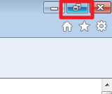
By re-sizing your browser window you’ll be able to see what the content will look like for a mobile user. Just click the ‘minimise window’ button in the top right hand corner of your screen.
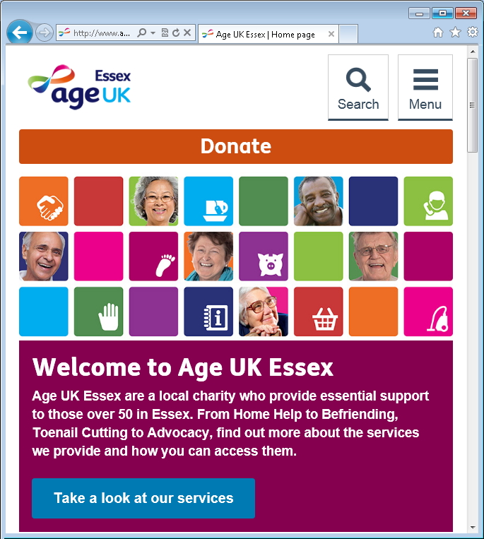
 When the window is full screen it will show the desktop version of the page:
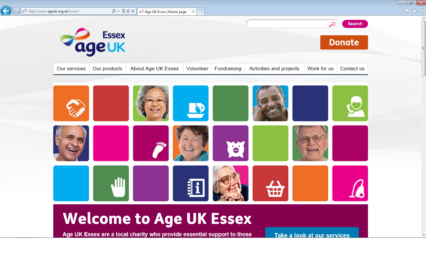
When the window is resized to be smaller it will show the mobile version of the page: